Skip to main content
Skip to footer
Skip to main content
Skip to footer

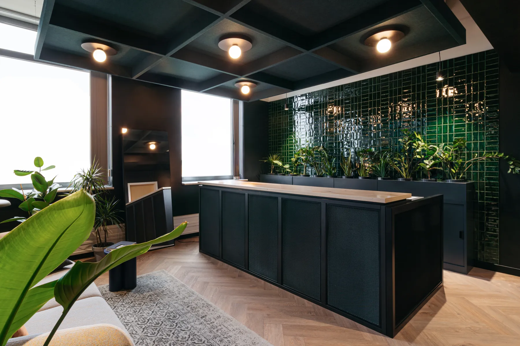
Color selection is one of those design decisions that works silently. Colors trigger emotions before anyone consciously evaluates an interior: the right shade sets the mood, decides how long guests stay in a restaurant, and affects employee focus in the office. That is how color psychology works in practice. Yet this is exactly the stage where mistakes happen most easily. They rarely come from a lack of aesthetic sense; more often, they result from rushing, judging samples under bad lighting, or blindly carrying 3D renders over into reality.
What looks spectacular on a monitor screen can disappoint in a real interior. Below we have gathered the mistakes that most often ruin commercial projects, along with tips on how to avoid them.
1. Blind trust in visualizations

Renders can deceive, even without any bad intent from the designer. Rendering engines show a space under ideal conditions: perfectly diffused light, a specific angle, and often without accounting for the physical properties of materials.
In the real world, the same interior gets cool, bluish light from the north in the morning and warm, yellow rays from the west in the afternoon. What is more, artificial lighting at 4000K can turn a fashionable, warm beige into a raw, bluish grey. Meanwhile, in an enclosed, windowless conference room, too dark a shade can make it feel like a basement.
That is why you should not blindly trust a visualization. So what can you do instead?
How to avoid this mistake?
The color decision should never be made either in front of a bright, glowing computer screen or in a sterile design office. The safest and only reliable solution is physical samples (so called mock ups). Order the sample in the largest possible format and take it directly to the site.
Hold the material up to the wall exactly where it will end up. Light behaves completely differently on vertical surfaces than on horizontal ones. Take a moment to see how the shade behaves in the morning, when crisp blue light comes in, how it looks under full, harsh sun at noon, and how it appears under the artificial lighting color chosen by the client. It often turns out that the same panel, which seemed perfectly neutral in the office, suddenly shifts into a cool violet or a dirty green on site, due to reflections from nearby walls or cheap bulbs. These few minutes of testing in the “real environment” can save the budget and your nerves ahead of a spectacular failure at the finish line.
2. Lack of composition and chaos (when everyone picks something different)

After a visualization turns out to be too optimistic, it is just as easy to fall into a second problem: multicolored, bold interiors can be stunning, but they also demand consistency and a solid knowledge of color harmony principles, something architects know well from their own practice. Without a well thought out structure, a space quickly turns into visual noise, where no single element gets the chance to stand out.
It usually starts very innocently: one crew paints the walls, another company supplies the flooring, and furniture and acoustic panels are ordered last from ready made catalogs. Each of these elements can look good on its own, but only together do they reveal whether the project is coherent. And this is exactly the stage where chaos happens most easily.
How can you future proof this?
Choosing a color palette should be based on proven proportions. A good starting point is the classic 60% 30% 10% rule:
- 60% of the surface is the base (usually neutral walls and floors).
- 30% is a complementary color (furniture, larger built ins).
- 10% is a strong accent that catches the eye and adds character (for example chairs in a chillout zone or decorative panels).
Before you approve any purchases, build a physical moodboard, meaning a set of samples of every material, from flooring to chair upholstery. It is a simple test that quickly shows whether the elements actually create color harmony, or just happen to sit next to each other.
3. Ignoring the color temperature of materials
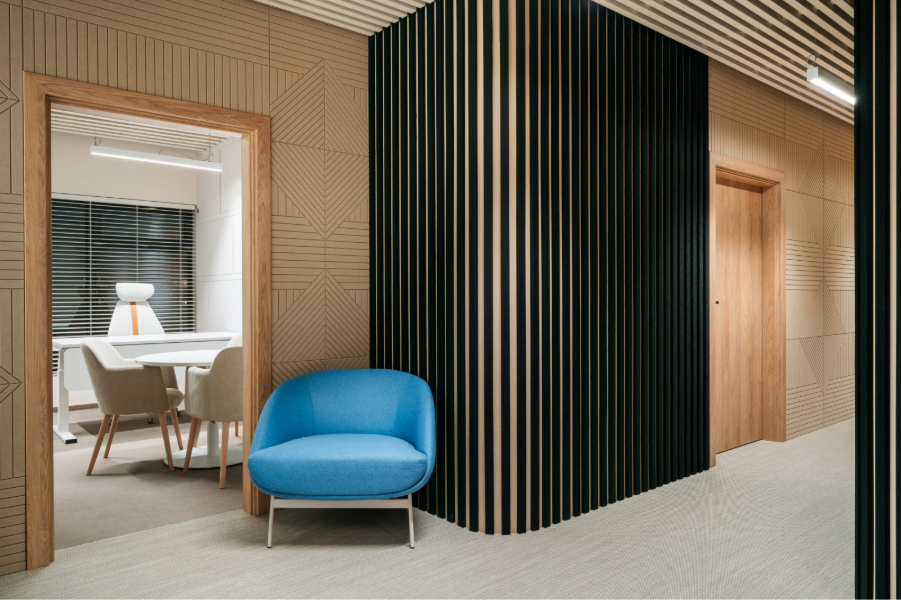
Color theory in practice is more than a dry code from the RAL or NCS palette. It is above all temperature and saturation, which, placed side by side, can completely transform, and sometimes ruin, the perception of an entire interior. If you combine materials with extremely different temperatures without a clear artistic intent, the space will start to feel disjointed, random, or in extreme cases simply dirty.
A classic and unfortunately very common mistake in commercial projects is trying to pair warm, honey colored oak on the floor or furniture with a cool, steel toned acoustic felt on the adjoining wall. In this setup, the physics of color contrast works against you: the cool, bluish background makes otherwise beautiful wood look unnaturally yellow or even orange. Warm wood, in turn, strips grey of its modern character, exposing its dull, sad undertones. Instead of working together, these materials clash visually all the time. A subconscious dissonance appears, one that cannot easily be neutralized later with small accessories or a change in light intensity. Understanding color theory lets you predict this effect before the materials ever meet on the wall. Applying contrast theory consciously means the pairing of warmth and coolness has to be bold, deeply considered, and balanced by a third element, not the result of chance during a quick materials shopping trip.
How can you future proof this?
Correct color pairings start with the temperature key:
- If your project is dominated by natural wood, stone, and warm textiles, choose panels and accents in earthy tones, such as warm beiges and deep browns (for example, from our Desert Sand, Sandy Beige, or Umber Brown color range). These tones naturally support the popular biophilic design trend, bringing a sense of calm, homely warmth, and harmony with nature into office or hotel spaces.
- Raw, minimalist offices built with concrete, steel, and large expanses of glass respond well to cool, decisive greys (shades like Wolf Grey or Moonstone Grey). In such spaces, cool toned panels not only underline the modern, industrial character of the architecture, but also, thanks to their soft, felted texture, soften the visual sterility and rawness of the glass and concrete.
4. Random splashes of color instead of a coherent system

Getting the color temperature and a consistent material base right is only half the job. Even the most beautifully composed palette, whether it relies on cozy beiges from point three or on raw greys, loses its charm if it is introduced into the space in a chaotic, selective way. In large offices or hotels, color rarely appears alone; it shows up on walls, suspended ceilings, desk enclosures, or sound dampening elements. If these elements are not tied together, the space feels disjointed.
A common mistake is “tacking on” colorful elements wherever there happens to be free space. The result is a mismatched patchwork that tires the eyes of employees who spend 8 hours a day in the office.
How can you future proof this?
How do you use accent colors without creating chaos? Work systematically, through repetition. If you settle on a distinctive accent color, for example deep navy or bottle green, make sure that motif recurs at different scales throughout the space. It could be the upholstery color on canteen stools, a detail on a light fixture, and a pattern on the acoustic wall panels. This approach creates a natural rhythm and makes the interior feel designed from A to Z.
5. Underestimating scale and volume
Even if you design a perfect, repeatable color system across an entire commercial space, keep in mind that the same palette will behave differently depending on the size of the room. What looks great in a spacious showroom or an open plan office can overwhelm an intimate meeting room. Color psychology shows no mercy here: dark, saturated colors, however elegant and consistent with the rest of the office, absorb a lot of light. Deep charcoal or burgundy in a small, narrow phone booth meant for quiet calls only works with excellent, targeted lighting. Otherwise, the user will feel claustrophobic.
How can you future proof this?
In small rooms and spaces without access to daylight, it is safer to work with a light base. Neutral, light greys and beiges visually push the walls apart and save the room from a “boxed in” effect. If you want dark colors, use them on a single chosen plane and keep the rest light.
6. Chasing temporary trends
Design institutes announce new trends every year, and manufacturers compete to promote the “color of the year”. Keep in mind, though, that a commercial project (an office, a hotel, or a clinic) typically has to last 5 to 10 years. A trend that feels fresh and exciting today can become a symbol of a bygone era in three years.
How can you future proof this?
Build a safe, timeless base out of high quality, neutral colored materials. Introduce trendy, bold colors only where replacing them later will not blow the client’s budget. It is far easier, and cheaper, to swap decorative cushions, small accessories, or move chairs around than to tear off glued on wall cladding or repaint dozens of meters of ceiling.
Acoustic panels: the element people remember too late
In many projects, acoustics only come up at the very end. Once the space is almost finished, it turns out that conference rooms or open plan offices suffer from unbearable reverb. At that point, people scramble for quick fixes, and the decision on how they look depends purely on what happens to be available in the warehouse.
That is a mistake, because modern sound dampening systems are not simple “sponges”, they are fully fledged, decorative wall panels that cover a large surface area and strongly shape the visual perception of a space. Every designer acoustic panel should be planned on equal footing with wall or furniture colors, so it supports the overall coherence of the interior palette and works with its architecture.
At Feltdecor we understand this perfectly, which is why our S line palette includes as many as 25 carefully selected colors. These colored acoustic panels give you full creative freedom: from raw, technical greys (Ash Grey, Wolf Grey), through warm, organic beiges (Desert Sand, Sandy Beige), to deep, bold shades (Galactic Indigo, Purple Rain).
What is more, an architect does not have to stick to standard formats. If your project calls for a unique approach, we create custom-sized acoustic panels in an individual color, perfectly matched to a brand’s visual identity or a specific design vision. This way, acoustic systems enter the project exactly when they should, as an integral part of the concept rather than an aesthetic compromise.
How can you make this easier for yourself?
You do not have to guess what a color will look like on the finished product. We launched a free online tool, FD Studio, where in just a few moments you can check a shade in RGB and pair several colors on a single wall using a 3D model.
And if you want to touch the material and see how it reacts to light in your designed interior, write to us, and we will gladly send you physical samples.